Responsive Design: Ensuring a Consistent User Experience Across Devices
By Udit Agarwal

In the rapidly evolving landscape of digital experiences, the diversity of devices used to access websites and applications poses a significant challenge for designers and developers. Enter responsive design – a paradigm that has revolutionized how we approach web development, ensuring a seamless and consistent user experience across various devices, from desktops and laptops to smartphones and tablets.
Understanding Responsive Design:
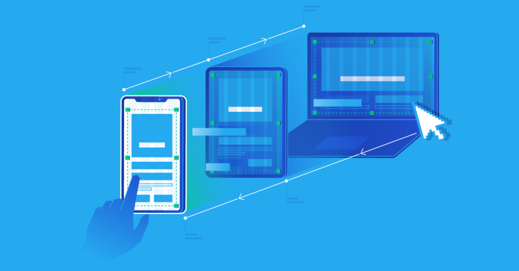
Responsive design is a design and development approach that prioritizes creating websites and applications capable of adapting to various devices’ diverse screen sizes and resolutions. The core philosophy is to craft a single design that responds dynamically to the characteristics of the user’s device, offering an optimal viewing and interaction experience.
Critical Principles of Responsive Design:
Fluid Grids:
Traditional fixed-width layouts can become problematic when viewed on devices with varying screen sizes. Fluid grids in responsive design size elements proportionally, creating a flexible and adaptive layout that adjusts seamlessly to different screens.
Flexible Images:
Images play a crucial role in web design, and responsive design ensures their adaptability. Using CSS techniques, images can be scaled or repositioned to fit the available space without compromising quality or breaking the layout.
Media Queries:
Media queries are at the heart of responsive design. These CSS rules allow designers to apply styles based on specific device characteristics, such as screen width, height, or orientation. Media queries enable the creation of device-specific layouts and styling adjustments.
Viewport Meta Tag:
The viewport meta tag is essential for controlling the initial scale and width of the viewport on mobile devices. It ensures that the website or application is displayed at an appropriate scale, optimizing the user experience for smaller screens.
Progressive Enhancement:
The responsive design follows the principle of progressive enhancement. It starts with a functional baseline experience on all devices and progressively enhances the experience for devices with larger screens or more capabilities. It ensures that the core content is accessible to all users, regardless of their device.
Benefits of Responsive Design:
Consistency Across Devices:
One of the primary advantages of responsive design is the ability to maintain a consistent look and feel across various devices. Users can access the same content and features irrespective of whether they use a desktop computer, a tablet, or a smartphone.
Improved User Experience:
Responsive design is synonymous with a positive user experience. Adapting to the user’s device makes the content accessible and readable, eliminating the need for excessive zooming or horizontal scrolling. It leads to higher user satisfaction and engagement.
Cost-Efficiency:
Developing a single responsive website or application is often more cost-effective than creating separate versions for different devices. Streamlining maintenance involves applying updates to a single codebase, reducing time and resources.
SEO Advantages:
Search engines favor responsive websites. Google, for instance, considers mobile-friendliness as a ranking factor. A design improves search engine rankings, positively impacting the website’s visibility and discoverability.
Adaptability to New Devices:
The digital landscape continually evolves, with new devices and screen sizes entering the market. Responsive design provides a future-proof solution by adapting to the characteristics of new devices without requiring a complete redesign.
Challenges and Considerations:
Performance Optimization:
Responsive design can sometimes lead to performance challenges, particularly on slower networks or less powerful devices. Optimizing images, minimizing unnecessary scripts, and employing techniques like lazy loading are essential for optimal performance.
Content Strategy:
Crafting a design requires thoughtful consideration of content strategy. Prioritizing essential content for smaller screens and avoiding content overload is crucial to providing a streamlined user experience.
Testing Across Devices:
Testing becomes a critical aspect of design. Ensuring that the procedure functions flawlessly across various devices and browsers is a complex task that requires thorough testing protocols.
User Expectations:
Users have come to expect seamless experiences across devices. Failing to meet these expectations can result in frustration and a negative perception of the brand. It’s essential to align the design with user expectations for a harmonious experience.
Also Read: UX Research Methods: A Deep Dive into User-Centered Design
The Future of Responsive Design:
As technology advances, design will remain at the forefront of digital experience strategy. The proliferation of new devices, including wearables and Internet of Things (IoT) devices, further emphasizes the need for adaptive and flexible design approaches. Designers and developers will continue to refine and innovate design techniques, ensuring that users can enjoy a consistent and delightful experience regardless of the device they choose.
Responsive design is a cornerstone in modern web development, addressing challenges posed by various devices. Its principles of adaptability, consistency, and user-centricity have reshaped the way we approach digital experiences, setting the stage for a future where seamless cross-device interactions are the norm.