Responsive vs. Adaptive Web Design: Which Is Right for Your Project?
By Udit Agarwal
Ensuring your website looks and functions optimally across various devices is crucial in web design. Responsive and adaptive web design are two popular approaches for achieving this. Each method has strengths and considerations, and choosing the right one for your project depends on your goals, resources, and audience. In this article, we’ll explore responsive and adaptive web design, their differences, and how to determine the best fit for your web project.
Responsive Web Design: Fluid and Flexible
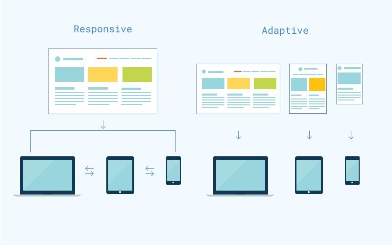
Responsive web design is an approach that focuses on creating a single website that adapts to different screen sizes and resolutions. This method relies on fluid grids and flexible layouts, using CSS (Cascading Style Sheets) media queries to apply specific styles and adjustments based on the device’s characteristics.
Here are critical aspects of responsive web design:
- Fluid Grids: Grids structure the layout in responsive design, often using percentages for column widths instead of fixed measurements. It allows content to adapt smoothly to various screen sizes.
- Flexible Images and Media: Images and media elements are scaled proportionally using CSS. Ensuring they don’t overflow or get cut off on smaller screens.
- Media Queries: CSS media queries are the core of responsive design. These queries allow you to apply specific CSS styles based on screen width, height, orientation, and pixel density.
- One Codebase: Responsive design typically involves maintaining a single codebase for your website, making it easier to manage and update.
Advantages of Responsive Web Design:
- Cost-Effective: Creating a responsive website is often more cost-effective than building separate versions for different devices.
- Easier Maintenance: A single codebase simplifies the implementation and maintenance of changes.
- Broad Compatibility: Responsive design works across various devices, from smartphones and tablets to desktops and large screens.
- User Experience: Users get a consistent experience regardless of their device.
Considerations for Responsive Web Design:
- Performance: A responsive site may load unnecessary content on mobile devices, potentially affecting performance.
- Complexity: Complex layouts and interactions may be challenging to adapt smoothly to all screen sizes.
- Load Times: Images optimized for larger screens can impact load times on mobile devices.
Adaptive Web Design: Tailored Experiences
Adaptive web design, also known as adaptive web development, takes a different approach. Instead of relying on a single, fluid layout, adaptive design involves creating multiple forms, each designed for specific screen sizes or device categories. We provide a tailored experience by serving these layouts based on the user’s device.
Here are critical aspects of adaptive web design:
- Multiple Layouts: Adaptive design involves creating distinct layouts for various device categories, such as smartphones, tablets, and desktops. We design these layouts to fit the characteristics of each type.
- Server-Side Detection: Adaptive design often uses server-side scripts to detect the user’s device and deliver the appropriate layout. This approach allows for more precise control over the user experience.
- Optimized Content: Adaptive design enables you to optimize content for each layout. You can prioritize content differently or even exclude some aspects on smaller screens.
- Enhanced Performance: Adaptive design improves performance on specific devices by delivering tailored content and layouts.
Advantages of Adaptive Web Design:
- Optimized User Experience: Adaptive design allows for a more customized and optimized user experience on different devices.
- Performance: Tailored content and layouts can lead to faster load times and improved performance.
- Precise Control: You have greater control over how your website appears and functions on various devices.
- Complex Interactions: Adaptive design can better accommodate complex interactions and animations on specific devices.
Considerations for Adaptive Web Design:
- Development Complexity: Building multiple layouts and implementing server-side detection can be more complex and time-consuming.
- Maintenance: Managing multiple layouts may require more effort for updates and changes.
- Cost: Adaptive design can be more cost-effective to implement and maintain than responsive design.
- Device Diversity: As new devices with unique screen sizes and resolutions emerge, maintaining adaptive layouts for all of them can be challenging.
Choosing Between Responsive and Adaptive Design:
The decision between responsive and adaptive design depends on several factors:
- Project Goals: Consider your project’s specific goals and requirements. Responsive design may be sufficient for more straightforward websites, while complex projects with specific device optimization needs might benefit from adaptive design.
- Budget: Evaluate your budget and resources. Responsive design is often more cost-effective, while adaptive design can be pricier due to its complexity.
- Content and User Experience: Think about the content you want to present and the user experience you aim to provide. If tailoring content and interactions for different devices is crucial, adaptive design may be preferable.
- Performance Requirements: Consider the performance needs of your website. If load times and performance optimization are top priorities, adaptive design may offer more control.
- Device Diversity: Assess the diversity of devices your audience uses. Responsive design may suffice if your audience primarily uses a limited range of devices. However, if you have a diverse user base with varying device types, adaptive design can offer a more tailored experience.
- Development Expertise: Evaluate your development team’s expertise. Adaptive design often requires more advanced development skills, while responsive design is more accessible.
Conclusion
In conclusion, both responsive and adaptive web design approaches have their merits, and the choice between them depends on the specific needs of your project. Understanding the goals, audience, and resources available will help you determine which approach fits best for creating a web experience that excels across all devices.